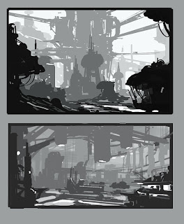
Example 1:
A. I lightly laid in a perspective grid to establish the space to guide my shapes. Starting with a midtone background, loose sketches are drawn in with a midvalue. I chose a angled composition for this comp. Quickly determine where light falls and shadow falls. At this stage, think of using graphic shapes rather than "render". We're more concerned about designing the page first.
B. By adding darker shapes, I establish shapes that are closer to the viewer. The focal point is off to the left so keeping focus on design, I try to relate foreground structures to it by "helping" point the direction into the payoff view. I'm being less subtle with these to illustrate the idea. Start adding the darkest value and the lightest value to achieve contrast.
Don't think about rendering at this stage, it's more about organizing your shapes within the space to read. Also, Flipping your images or looking at them upside down will tell you if the comps are balanced.
Don't think about rendering at this stage, it's more about organizing your shapes within the space to read. Also, Flipping your images or looking at them upside down will tell you if the comps are balanced.
C. After refining the shapes a bit more, these will be sufficient enough at this stage to get an idea of how the environment will play out.
The following examples are done with similar steps, but I went with a less sketchy start with this one and kept it clean. One thing to stress at this stage is that I'm not concerned with establishing atmoshpere yet. Just design.
The following examples are done with similar steps, but I went with a less sketchy start with this one and kept it clean. One thing to stress at this stage is that I'm not concerned with establishing atmoshpere yet. Just design.
Enjoy!


